Polaris Design System, Chargepoint
When I joined Chargepoint in 2020, the design system consisted of colour styles, typography and a few components such as buttons and input fields. The developers were not working with atomic components yet. Therefore, together with our lead FE developer we started building an atomic design system. Keeping in mind that the focus of our users is to run fleet operations, I redesigned the existing styles and components. Often times I was looking for inspiration and help from established systems like material design or Carbon Design System.
Developers used Bootstrap for some styles, some components were built from the scratch and some used external libraries, like Apexcharts for our charts, to implement the designs. Sometimes those components needed adjustment to meet our specific needs, it was not ideal yet. Storybook was the living version of the system, whereas Abstract had the design specs and Confluence the documentation. The very first components were tested and implemented in one of the first atomic environments, the Smart Driving web app. The atomic team grew and we managed to cover all necessary styles and components. Soon, our legacy apps started to convert to atomic styles too.
Meanwhile Figma upped its functionalities and after a thorough consideration our team that grew by several designers decided to switch from Sketch & Abstract to Figma. During the first few weeks of the transfer from Sketch to Figma, I was mainly figuring out (yeah, you got it - lots of Youtube haha) the auto-layout feature. Slowly I imported our colour styles and typography to Figma tokens (for more general styles we decided to work with Tailwind CSS framework) and converted all our Sketch atoms, molecules and organisms to be using Figma auto-layout.
I found quickly that one of the big advantages of the auto-layout was the immense ease of making responsive designs. Also having CSS specs correlating better with developers specs e.g. visible padding, proved to provide even more efficient hand off to the front end team. For example, when I was designing a molecule component, a developer was in the same file seeing what I was doing and was building it simultaneously with me.
Currently, we are setting up more efficient processes e.g. pushing Figma tokens directly to Github. Devs are now using one library for behaviours i.e. React Aria, which also helps us in our goal to improve the accessibility of our components. We created an Accessibility template check-list (see below) for creating atoms, molecules and organisms to ensure we comply with WCAG 2.2 level AA.
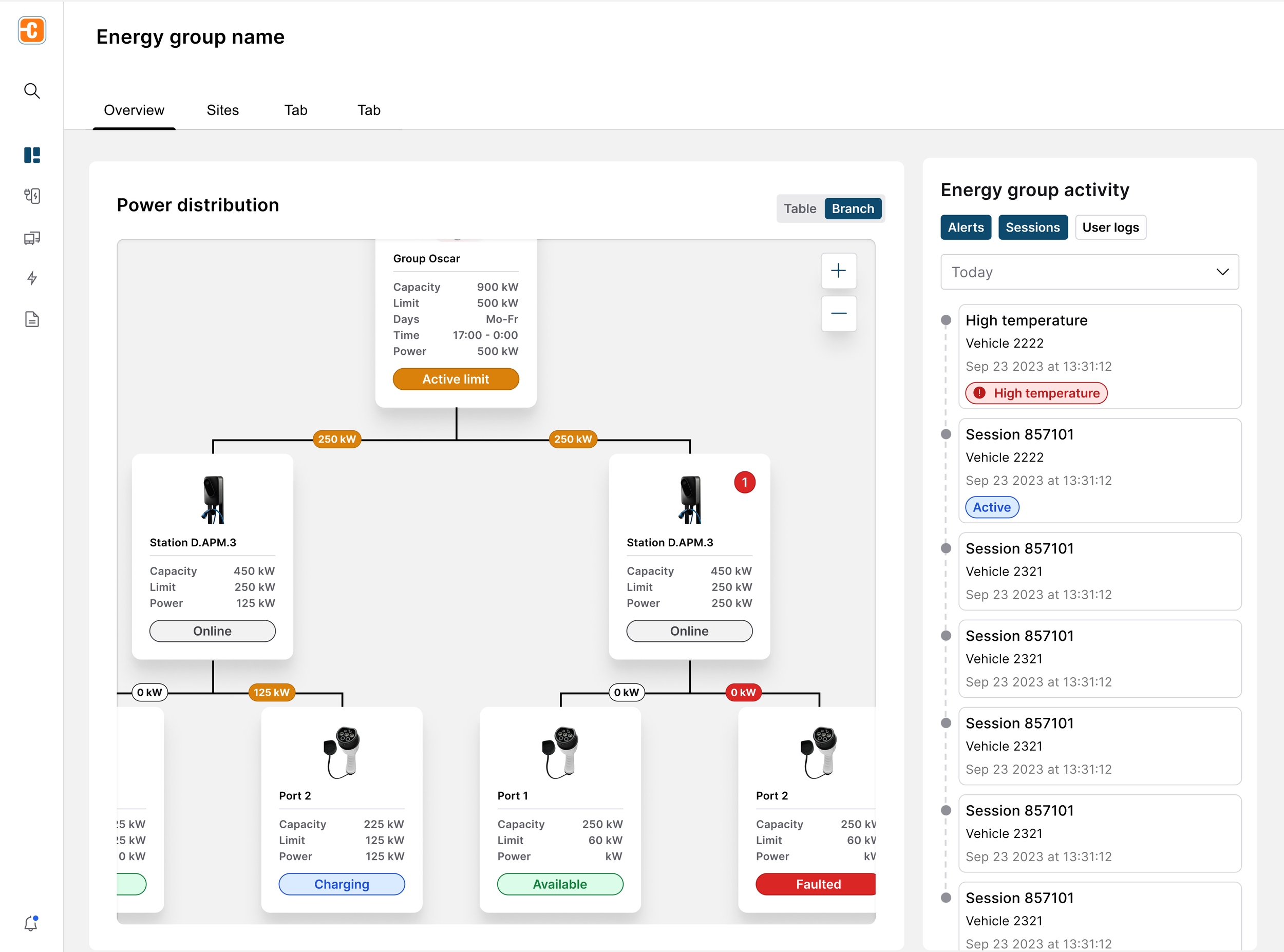
Examples of the design components put together in an Energy group detail page and dashboard.


